Showing posts with label Luthais Morrison. Show all posts

Wednesday, 5 December 2012

Evaluation Task 3 Planning/Script


  • Whole music video
  • Ancillary tasks downloaded onto a phone
  • Talk about pitch feedback
  • Talk about rough-cut feedback from Holly
  • Feedback on final video from classmates
  • Record on Wednesday
Unfortunately, it did rain during our shoot in town. This meant we did not have time to rearrange the location of the filming. 

Luckily the rain soon stopped so we were able to continue unabated. 

Our narrative remained essentially unchanged. The only thing that differs is the lack of a girlfriend or argument as we instead opted to only utilise the singer for this narrative section. 
This was mainly because we felt the inclusion of this narrative thread would feel tired, trite and cliched.

We conformed to genre conventions of indie rock as originally planned. The only thing that might be conceived as uncharacteristic is our ancillary texts as we have used a brighter colour scheme for these products compared to current artists.

When it came to the drama studio, we decided to use the music studio instead. Unfortunately this has bright green walls, so the use of desaturation during the editing process manages to hide this fact as well as stick to genre conventions.

Well, firstly we have used a house for a setting in our music video. Secondly we stuck to our original idea and interpretation of the song which we believe ended up in a successful video.

Our teacher Holly watched our rough-cut and gave us feedback on what we've done so far and what she feels could be added to the video to improve it. One of the first things she picked up on was the good performance of the band members and particularly Michael's role as the lead singer & guitarist. 
Holly also said we need to be aware that we'll need to keep up the pace of our cuts and editing, especially our edits on the beat. Because of this advice we were conscious to maintain the same speed of editing.
After other suggestions from Holly we also implemented more cutaways to Michael walking in the streets and the use of split-screen in our video.

After we finished our music video and ancillary products and uploaded them to the blog we received feedback on them from our classmates and peers.
For the ancillary products there were comments that were raised multiple times, either positive or negative.
A positive point that was brought up by all of the groups was the good use of colour and effects in our poster and digipak. The posterization we used on the band members was a popular effect we used so we're pleased with this feedback.
Other positive feedback included that it represented the artist and genre effectively, the information was clearly visible and that the magazine advert and digipak were closely linked and there was an obvious theme.
Unfortunately we also received negative feedback for these ancillary texts. Though thankfully this was minimal, as the only negatives were the lack of "extra" information on the magazine advert and that the back panels of the digipak were too plain.
When it came to the magazine advert we were fine with this negative feedback as we purposefully neglected to include any reviews or quotes about the digipak. We did this to maintain our minimalist theme of our products and we felt that it also fitted with our genre conventions.
With the negative feedback about the digipak, we believe this to be fair, but are also adamant about the reasons we did this. The spaces with only our background pattern are where we're putting the DVD and CD so we decided that we should keep this area clear because it'd be wasted time and effort for something the consumer will not be looking at.

With the feedback on our music video, again it was mostly positive from our classmates. They almost unanimously agreed that our video used a wide variety of shot types, was well edited and fitted with our genre's conventions. The only negatives we received is that they felt we should have included more shots of Michael walking down a certain street because they felt it was effective.
We agree that this was an effective shot but we used it to it's capacity for the video, and because it is a narrative video we can only include it in sequence.

Sunday, 2 December 2012

Evaluation Tasks

Task One


Picture 11

This clip here (0:32) shows one of the multiple shots we did of the band performing the song. Focusing on one band member at a time allows us to show off their individual skill, which is a genre convention for indie rock music videos. Because of this we have included a lot of these shots in our music video, either of the bassist plucking the strings, the drummer hitting his symbols or of the singer strumming the guitar. To keep in time with the song and to make sure the video is engaging these shots are kept short, at most only lasting a couple of seconds before we switch to a new shot.

Picture 12

Here (0:34) we see an unusual shot type we experimented with in our music video of the camera moving down the bassists guitar neck. We used this because during our research and planning stage we found that a large number of indie rock music videos use a wide array of shot types including more experimental, unconventional shots such as this. This shot was easy to accomplish and it fulfilled our need of interesting shots that stick with the convention of this genre.

Picture 16

In our video we used tracking shots in both the narrative and the performance sequences. The screen shot here (1:00) is during a narrative sequence. Here we tracked the singer leaving his house, but we also edited the shot to create an interesting image. Again this type of editing is used frequently in the indie rock genre as it creates a "quirky" off-kilter vibe for the music video.

Picture 17

At this part of the music video (1:34) we have used a tracking shot as the singer makes his way towards the centre of town and to his friends. We wanted to keep this interesting and off-kilter we decided to use an action in this shot to help with that. Here we see the singer throw away both his coat and his shirt only to have his coat inexplicably thrown back to him. We used this because we noticed that there was a continuity error we had missed while filming as we filmed on separate days, the singer was wearing a different top. I then came up with the idea of using this type of shot/action to create an interesting part of the video, fix the continuity error and stick with genre conventions.

Picture 18

This screen shot (1:52) shows a major genre convention we have stuck to. This is a performance sequence with the bad as a whole. This was featured in just about every single indie rock music video we researched so we obviously took cue and followed suit. This shot shows the band as a whole, playing the song to give the audience an idea of how the band act together, and what they might be like live. Unfortunately because of a lack of space, equipment and band members, we were only able to use 3 people in the band. While there are various 3-piece indie bands, e.g. The Subways, unfortunately we can quite clearly hear instruments that are not being played on screen.

Picture 46

This split-screen (2:38) was used under the suggestion of our teacher Holly. The split-screen effect is used in certain indie rock videos and multiple other music videos from a wide range of genres. We kept ours relatively short compared to some videos that use this effect, but because of the movement used and our inclusion of other important genre conventions it is still effective at attracting audience attention.

Picture 47

At this section of our music video (3:02) we seen our singer finally reach his destination and meet up with his friends. We shot this at a sunny time and location because we wanted the lighting to reflect the mood of the singer as well as reflecting the mood of the lyrics. This is another genre convention we have used, narrative that reflects the lyrical content, to create a better music video than if we had ignored it.

Music Magazine Advert template

Here is our finished magazine poster. As you can see with have kept this style minimalist featuring only a face for the poster. This is a genre convention as most of the posters and magazine adverts we saw for indie rock groups kept the designs minimal and a large amount used a head or a face, usually with some form of "twist". An example we looked at while still in the research and planning stage for our ancillary products was this Kings of Leon poster. Here you can see that it has used a collage effect to create an overall head from composites of the band members. However they use a very muted colour pallet whereas we decided to go against convention and keep ours brighter and more colourful. We decided to do this because we felt it better reflected the band we had chosen, whom mainly compose songs about and aimed at late teens, as well as being able to attract other audiences better.

digipack_1

Here is our final digipak design. We created an obvious link between our two ancillary products, the posterised faces and the background patter. This again was a genre convention as most examples we researched had some form of obvious link between the two, whether it be the cover or a general theme. We have again kept this light, using a pale blue for our background and having the band members in shades of bright colours. The only dark parts of this are the black backgrounds against the white text. We have used this because it creates a feeling similar to that of old Polaroid photographs.


Task Two


Task 3


Task 4


Oh Yeah
by: BeachesAndShores

Thursday, 29 November 2012

Final Ancillary Texts

Music Magazine Advert template
This is our final version of our magazine advert. We have put all needed information on this advert. The audience will know who's releasing the digipak, what the digipak is called, when it'll be released and where they can buy it. We have also included information on how to contact the artist.


digipack_2
digipack_1

Monday, 26 November 2012

Final Music Video Feedback

DSCN1916

We received feedback for our final music video from all the groups in our class. When all feedback was reviewed, we spotted a number of things:
  • The music video definitely has appropriate content
  • Mise-en-scene has been payed close attention, as there were use of costumes and different lighting techniques
  • There was controlled use of the camera
  •  A lot of different camera angles were used
  • The editing was effective of creating a linear meaning
  • There were a few effects and transitions included in the video
  • The editing worked perfectly with the pace of the song
  • Lip syncing was effective
  • Apparently the star persona is not clear
  • Overall, the music video was well executed
Taking this feedback into account, we believe the music video we creating is outstanding. One thing we should improve on in the future is making the star persona more clear to the audience.

Thursday, 8 November 2012

Digipak Ideas

After experimenting with using posterization in photoshop, we have agreed that this can create an interesting and effective cover.
We have discussed using all 3 members of the band on different sides of the Digipak, with Michael, the lead singer in our video, being on the cover.
Using this we can create a continuous feel for the digipak. Saying this though, we do feel that while minimalism is a genre convention of indie rock album covers, using just posterized faces like in our previous post may be too simplistic/minimal. 
To combat this we are thinking of inserting a continuous pattern into the back ground. An example of this would be from the band Kid, You'll Move Mountains, who in both their advert for their album "Loomings" use an interesting pattern.

Here, in the advert for the album, it is used to create a wave like effect, which we like. We are thinking about using this kind of pattern, or one very similar, to give a more interesting and diverse look to our cover while maintaining an indie rock and minimalistic feel.


In the album cover, the same pattern is used to a different effect, rather than creating a wave-like effect, it acts more as a background pattern to break the monotony of the image.


Digipak Test Posterizing

Here we have an image we posterized manually of popular musician Neil Fallon of Clutch.
We have done this so we can assess the effectiveness of using posterized images for our digipak and/or magazine advert.

Here is the original picture for reference:


And this is the version we posterized, and we believe that this technique can be used effectively for our Digipak if done well:


Monday, 5 November 2012

OKGo Music Video Analysis


In this video by OKGo, the band use a very off-kilter video, using a random sequence of events and a domino effect that doesn't relate to the music video, with the band members themselves in the background.
This is obviously an unconventional music video, but it's still effective as it can grip the audiences attention rather quickly with them trying to follow the sequence of events in the video.


"Here It Goes Again" is another unconventional music video by OKGo.
One of the most obvious things here, is the lack of cuts and camera movement, the footage is captured solely from a static camera.
Another rather obvious unconventional aspect of this video is the fact there is no performance by the band, instead the video is the band doing a routine on the treadmills.

Music Video Exhibition on The Internet and TV

 Many TV channels broadcast music videos, such as Kerrang, MTV, Viva and Fuse all play music videos throughout their programming . MTV and Viva both play almost exlusively Top 40 songs though will sometime play older pop songs in a playlist format. Kerrang and Fuse on the other hand play mostly if not, only rock songs and are a channel much more likely One Night Only would be shown on. It also means it'd be unlikely for our video to be featured on MTV or Viva as their selection of music videos is very restrictive, as our song would have to be popular beforehand to get on these channels and One Night Only is not popular enough to gain entry into their channels.
Kerrang and Fuse on the other hand play less popular songs and have a broader range of material used, as they play rock songs from many sub-genre's.

Online, there are multiple places where audiences can watch music video, the most obvious would be YouTube where anyone can upload their music to promote themselves. Multiple artists have launched successful careers off of uploading music videos onto YouTube.
Another place where audiences can be introduced to new musicians would be Vevo, where bands signed to either  Universal Music Group, Sony Music Entertainment, and EMI videos can been seen here.


Use of Social Media to Increase Consumption


One Night Only make use of both Facebook and Twitter, this allows their fans to interact with the band and helps promote their band persona by showing the band in their down time and their thoughts throughout the year. They also increase the consumption of their music using these social networks and they can do this by posting updates on what they are doing, such as announcing plans for new albums or music videos and posting songs so fans and casual browsers can hear their output. The use of Twitter can increase consumption through word of mouth quickly as a fan can retweet so more fans see and then they can retweet that, etc. so more people have a chance to stumble upon the band and be introduced to their work. The more places you promote your band the more consumption you will get.


Ancillary Texts (Digipak and Magazine Advert)

For the main idea of our digipak we did some research into what a indie cover might look like, and came up with these common features of an album cover:
  • Use of filters if the main image for the album cover is a photograph.
  • A lot of indie album covers use drawings or abstract images.
  • Text is kept minimalist, usually just block white on a black background.
  • Text for album covers is usually kept on the sides of the covers instead of the centre.
  • The band may also appear on the album cover.
  • Colours are usually crushed of slightly desaturated.

  • Using these notes to get an idea of what the cover should look like, we decided to make a mock album cover which ended up looking like this:


    This is just an idea for what we might use for our final product, as we feel it follows the conventions for indie album covers we've seen so far. The minimalistic appearance helps us stick with convention, though hopefully we'd go for something relating more with the title of the album, as this is just a rough idea and also something more abstract. We hope that keeping things unfussy fits with the style of the bands music and it's tempo.

    After researching indie album covers, we came up with this list of consistent themes:

  • Must contain the band name
  • Must make it clear what it's advertising
  • Either has a picture of the band, or a drawing
  • Is either square or vertically long
  • The text is big and attention grabbing


  • Rough Cut Feedback

    Some feedback we have received:

    • Good performance
    • must keep up with pace of edits
    • Reduce length of clip thats sped up
    • More cut aways when Michael is in the street
    • Try split screen?
    • Remain focussed on lead but show more of band members
    • Ensure there is a conclusion

    Analysing Goodwin's Framework and Evaluating Microelements.

    Goodwins Points Analysis

    1. Genre Characteristics

    For our music video we have conformed to genre characteristics, so we make use of performance sequences to show the band's talent. To be able to perform the performance sequences I brought in my bass and guitar. We also managed to acquire the use of a bass and a performance area for the filming. Having this performance area and the props needed for filming allowed us plenty of opportunities to shoot performance sequences for the video.We also made use of a narrative for our music video, showing our lead singer leaving his house to meet with some friends. The way we use this is by cutting from the performance sequences to the narrative sequences intermittently so we don't bore the audience and can progress the music video.
    By doing this we have hopefully managed to create a music video fitting with the indie rock genre.

    2. Visuals/Lyrics

    We don't make much use of matching the visuals to the lyrics besides lip syncing. The only other time we have matched the visuals to the lyrics would be when the singer is leaving his house, the lyrics
    "You wanted me to stay at home
    But I didn't want too"
    Here we have a sped up tracking shot of the singer leaving his house.

    3. Visuals/Music

    We have matched the visuals to the music in our video so far, as we have edited on the beat throughout the video. We did this as we believe this makes it much easier for the audience to watch as it makes the video flow. It also helps the video much more professional as the editing comes across as seamless.

    4. Need To Sell Artist

    We have made the singer the focus of our music video, in both the performance and the narrative sequences.
    For the performance sequences we have also included shots of the drummer and bassist but because we wanted to include lip syncing and to follow genre conventions the singer is the prominent focus. In the narrative sections we have also made the singer the focus, as we again wanted to sell the artist as this is what a record company would want as this promotes the band's image.

    5. Intertextuality

    We haven't included much intertextuality because we didn't see how to this would really be relevant to our music video. The only piece of intertextuality we have included so far is the singer's Nirvana t-shirt in the performance sequences and we included this because we felt it would show the bands influences.

    6. Voyeurism

    We have used voyeurism in our music video as the audience sees the artist at home, what his lifestyle may be like and by showing the small amount of the house they can see what his home life is like. Later in the music video they will also see what his social life is like and where they socialise.

    Micro Elements Analysis

    1. Editing

    So far we have used a couple of editing techniques to improve the image our music video. We have used a desaturation filter over the performance parts of the video as this helps hide where we filmed this sequence as originally this was a green room for our Sixth Form's media department and so it had bright green walls. Editing on the beat is another technique, which makes the video easier to follow for the audience and look more professional. We also made use of a fade at the start of the video to smoothly start the video instead of a sudden start. Speeding up clips is another way we edited our video. When the artist is leaving his home, and we have a tracking shot, we sped up the clip 500% because the song speeds up slightly here and this matches the tempo and beat of the music.

    2. Cinematography

    We used many different shot types throughout the video to make it interesting as repeated use of the same type of shot would make the video look unprofessional and difficult to watch for the audience. We have used the normal close up and mid shots which just add a variation of distance between the camera and the object (artist normally), we have also made use of tracking shots of the singer in the video, as the camera movement helps the flow of the video. Using over the shoulder shots is another shot we used, most prominently seen when the singer is leaving his house, which we also combine with a tracking shot. We have used high angle shots for the performance sequences of the band members and also of the singer when he is laying on his sofa. Extreme close ups on the instruments to see the band members playing them and in the start of the music video where we see an amp being turned on and the bass being tuned. A low angle shots have also been used, with the singer in the performance sequence and also in the narrative sequences too. We have also use a dutch angle shot briefly in the performance sequence where the camera tracks down the neck of the bass.

    3. Sound

    The main sound in the video is the track playing, however we have also at the beginning of the video left in the diagetic sound. This diagetic sound is of the drummer warming up, as we can hear him gently hitting his drums and of the amp being turned on.
    Once the lead has been plugged into the amp the non-diagetic sound of the music starts.

    4. Mise-En-Scene

    For mise-en-scene, we were very careful about what we used and what was filmed. For the costumes we were very conscious of continuity of the video, so we made sure that different costumes were worn for the performance and the narrative sequences. Also because we filmed the performance on two separate days we made sure that the same costumes were worn. We only used natural lighting in our video, as when we began filming we realised that the natural light was fine for shooting as everything was clearly illuminated. The props we used were, alcohol in sequences not yet included in the rough cut, which was to show his casual lifestyle and socialising with his friends and the instruments used when performing.So far we have used three main locations, the singers house, the performance space and finally the village the singer is walking through. Later more locations will be added, such as the centre of Cambridge and Christ Pieces where he will be meeting his friends. Make-up and hair were ignored as we have an all male indie band so the band members needed to come across as aloof and carefree and having a pruned look would ruin that image.

    Improvements

    1. Experiment with some other filters, to help create a distinct look, mainly in the narrative sequences.

    2. Use more cuts, the beat of the song is fairly quick we need to decide whether we want to cut on the bigger beats or onto the quicker, small beats of the song as this will decide how many cuts we will use in our music video.

    3. Include more intertextuality, as we only have once piece of intertextuality and including it would be something that would make the video appear better as it would show knowledge of other media or other artists work.

    4. Use of a lager performance space, as the space we used was quite small and so fitting the entire band and instruments in left it rather cramped. It also left very little room for camera movement and different shots as the space was so limited.

    5. We could include more people in the music video, as we have a small 3 piece band at the moment and the singer only meets two friends later in the video. Including more people would make the singer look much more popular and give the social aspect of the video a bit more significance.

    Additional Time Usage

    If we were to use an additional nights of filming time, it would used to shoot more narrative scenes. This would be so we could include more shot types and camera movement and we need to refilm certain shots as we can see equipment in some shots making the video look unprofessional and sloppy.
    Also, as the weather was a dull and drizzly day, we would be able to get a more light hearted feel for the video as the sun would impact significantly on the overall feeling of these scenes.

    Wednesday, 24 October 2012

    Rough Cut

    Costumes


    Singer's costume (Michael Moursi);

    (For the narrative sequences).

    - The singer will wear a long coat, most likely a duffle coat in a passive tone yet not too earthy, something in the blue spectrum, in a darker shade.

    - He will also be wearing tight fitting trousers, in a park tone, but not too similar to the shade of his coat, darker. Black skinny jeans for this sequence.

    - He will also wear a muted plaid shirt, featuring red and green, adding in colour into the wardrobe without becoming a singular focus for the outfit.

    - For his shoes, we will have the singer wear brown leather and suede chukkas, to help complete this indie outfit.

    (For the performance sequences).

    - The singer will wear a white, or similar low-key colour, t-shirt. It would be a band t-shirt of a band in a similar style to the band. Something like Nirvana or The Ramones.

    - He would also wear black, slim/skinny fit trousers in black.

    Drummer's costume (Elliott Slingsby)

    (For the performance sequence)

    - In this sequence the keyboarder will wear a black hooded jumper.

    - He will also wear a checked shirt underneath this, featuring red, blue and white, this will again add colour to this wardrobe but we'll play it down by either covering it slightly by the jumper of desaturating the colours.

    Guitarist's costume (Luthais Morrison)

    (For the performance sequences)

    - The guitarist will wear a white T-shirt, possibly with a print on it, but the print must not be too in your face.

    - Luthais would wear loose, baggy trousers.

    - To complete his look, he will wear brown boots.

    Monday, 22 October 2012

    Focuses & Ambient Audiences

    For this blog post I will be referencing "Can't Stop" by The Red Hot Chili Peppers, which you can see below.


    How does the chosen music video appeal to the focus audience:
    The focus audience for the Red Hot Chilli Peppers is (approximately) mostly males between the ages of 15 - 25, so anywhere between young teens and young adults. The way they appeal to this audience in the video, is mainly the theme of general silliness, and non-sensical scenes. For example, there's a scene where Anthony Kiedis, the lead singer, is getting empty plastic bottles wedged inbetween his legs and arms by one of the other band members.
    The whole theme of silliness appeals to the alt rock audience, because people don't listen to alternative rock for whole hearted meaningful lyrics, but just because it sounds good. So making a video of the band being silly seems more real, and people watching can relate to being quirky and crazy.
    To add to the theme, there's a wide array of costumes, that go from a "Tent Suit", to a giant purple dinosaur head. On top of this the video has zero to very little narrative, and literally is just a video consisting of crazy non-linear scenes of the band being zany.

    Thursday, 18 October 2012

    Qualitative Audience Research

    While doing audience research we used a quick questionnaire to gain an insight in what audiences expect of our song and it's music video.

    To get the best results possible we played the audiences the song and then proceeded to ask them questions from our questionnaire.
    The questions we used were:


    1. Did you like the track?
    2. What type of person would like this track?
    3. Which age range would you typically associate with this song?
    4. How would you picture the band/lead?
    5. What sort of music video would you expect to accompany this track?
    6. If performance, where and what type?
    7. If narrative, what sort?

    Audience #1

    1. It was alright but something I wouldn't normally listen to or find.
    2. Average teenager/young adult would probably be the type of person I would expect to listen to this track. "Indie" types in particular.
    3. 12-20's
    4. Black/dark hair, scruffy facial hair, wearing jeans and a t-shirt. Laid back style/attitude.
    5. Mainly performance rather than a solid narrative.
    6. Small gig e.g. pubs, bars, the junction. Maybe practice sessions like in a garage.
    7. A consistent narrative/small, self contained story.
    Audience #2

    1. Yeah I liked the song.
    2. Indie music types. Kings of Leon people.
    3. 14-20's
    4. Curly/indie hair, skinny jeans and stuff.
    5. Narrative based, with a simple story. No performance sequences.
    6. Small pub, like the Portland Arms
    7. In the narrative, he would be playing a videogame, then the camera would go into the game and the character would be him. Like the "Califonication" video by Red Hot Chili Peppers.
    Audience #3

    1. Yes. It's the style of music i like to listen to but felt the chorus could have been differentiate from the verse in a better way.
    2. People who like Indie, maybe some soft rock style of music. 
    3. Probably teens to 30 years. Mostly a male audience.
    4. Probably quite casually dressed but still with a particular 'look', such as certain haircuts or style or trainers etc
    5. I think there would be elements of performance to show off the bands skills and talent, so that audiences would know what to expect at a gig. Also maybe some shots of the audience. This would be intercut with some narrative elements to reflect the lyrics. 
    6. Small venue with a small stage, more of a focus on lighting and instruments rather than grand venues and costume.
    7. Narrative would feature a band member as the centre of the storyline. In locations that are relatable to an everyday audience member. 
    Audience #4

    1. I liked it, it's definitely something I'd listen to.
    2. Relaxed people, people who put the music on in the background and chill out. Just lounging about.
    3. 16+
    4. Laid back attitude. Casually dressed but not in tracksuits or anything similar.
    5. Mix of both. Some narrative sequences, but the majority of the video is of the band playing, with the narrative sequences just used to accompany and support the performance sequences.
    6. Practice session, in a very small location. Not too cramped but definitely not spacious.
    7. Singer walking through town, shots of him singing the lines in the song. 
    Audience #5

    1. The song was pretty good.
    2. Ambient music, played in the background of a house. The people might not buy the whole album but this song is something they'd listen to as they relax.
    3. 13+
    4. Conservative style. No mohawks, dyed hair or piercings. Just a fairly average guy, with a chilled attitude.
    5. Mainly narrative based, focusing mainly on the singer but with performance sequences to add to the video.
    6. Small, low-key venue, such as a music based pub or a plain room.
    7. Relationships would feature, relationship changes like a falling out, a break up and mood changes. Happy to sad etc.
    Audience #6

    1. Okay, but not my type of thing.
    2. Indie kinda people.
    3. 15-19
    4. Skinny jeans, converse, t-shirts and fashionable haircuts.
    5. Them playing I would say.
    6. Small venue, just them playing. No crowds.
    7. Just walking about really.

    Theoretical Study Into Audience - Uses and Gratifications

    Our audience would approach and use our product for the reasons that Blumler and Katz argued, that audiences are active and not passive and will approach and use our music video for the following reasons:

    Diversion - our target audiences are teenagers and young adults, these people can be pressured by the everyday stress of college, university, coursework and exams (teenagers) and work in general (young adults) and they could use our music video as a distraction to help them overcome the stress and to help them relax for a while.

    Personal Relationships - our target audience could gain companionship with the singer in our music video, the audience may be able to feel like they know what the singer is going through. The narrative could also be a centre for conversation with others about the music video because of the fact that it could be viewed a lot of people included in the target audience and that some points in the video could be a topic for conversation, like the similarity/differentiation of our video compared to others.

    Personal Identity - the target audience would most likely be able to compare themselves to the singer in our music video through the narrative that is told in the lyrics and represented through the video. They could see that they need to just go out and have some fun like the singer in the video does which would help them to answer a question on their identity and re-affirm what they should be doing.

    Surveillance - this is something that the target audience wouldn't use our video for as we don't supply any information throughout the video and so the audience would only view the video for pleasure and nothing else.


    Wednesday, 17 October 2012

    Editing Techniques: Cuts

    One vital part of the editing process which can make or break a music video is the number of cuts included in the video. Usually the cuts are made on the beat of the song and can make a music video look very smooth and professional. To get an idea of how many cuts we should perhaps use in our video, we decided to look at a mainstream music video and count how many cuts are in the video altogether.

    Watch the video here

    PSY - GANGNAM STYLE is a mainstream video at the moment which has gone to number 1 in the UK Chart Top 40 and has gained 480 million views on YouTube in the first 3 months. We counted around 170 cuts in the video but it was hard to count as at 2 parts there was some very fast cuts between alternate shots fitting about 20-30 cuts in the space of 3-4 seconds. This isn't something we would do in our video as there aren't any beats in the song to match this speed. However the overall figure of 170 cuts taking out the very fast cuts means that we ought to aim for around 120 cuts for the video to look smooth and professional like the current mainstream videos do.

    Thursday, 11 October 2012

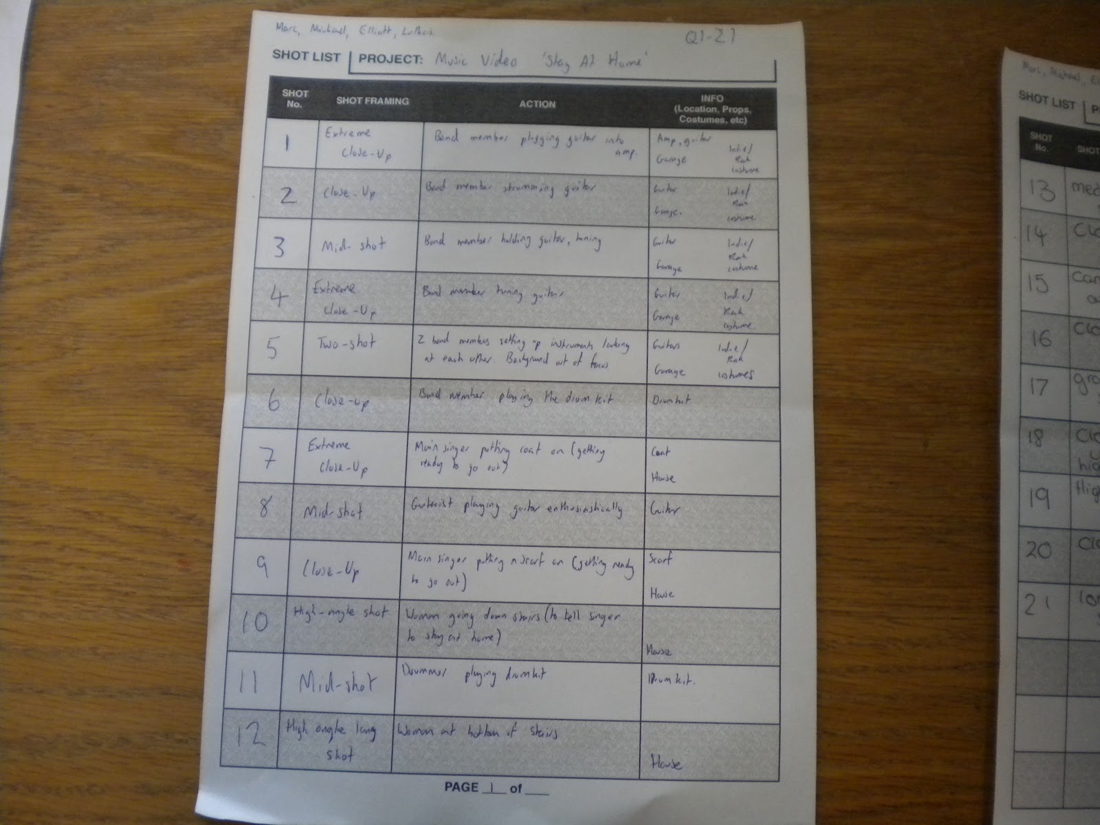
    Storyboards, Shot Lists, and Call Sheet

    Text
    This shot list shows what shots we want to utilise in our video and where. This may not be exactly what is shown in our music video but will be approximately similar.


    These shots of our storyboard are showing the basic premise and start to our music video. This again is subject to change but the basic premise is going to stay the same.


    Here we'll have more shots than shown, stressing the importance the performance of the singer at this time.


    This storyboard shows the narrative of video. Again this may not be precisely what is in the finished video but the overarching "story" of the video will be the same.


    Here we will have more shots of the band performing, making use of a lot of small, quick shots to have a more up-tempo feel to the performance making it fast paced.


    Here is our production sheet, showing some locations we'll be using, contacts for that location and who the director and cameraman are for our project.

    Alternative Music Videos


    Johnny Cash - God's Gonna Cut You Down


    This video is quite alternative as Johnny himself doesn't actually appear in the video himself at all, most videos have the main singer as the person at the centre of the video. The video also has no narrative structure, the video just consists of various shots of celebrities which has no meaning to the song or lyrics. You do see quite a lot of videos that have a narrative structure, but then you do see a lot that have a weak narrative that is hard to follow. You don't see many with no narrative at all and this and the fact Johnny doesn't appear in the video himself shows that the video is alternative and breaking the norm.