Media Project
by: Stormatree
Task 3
Thursday 13 December 2012
Wednesday 12 December 2012
Wednesday 5 December 2012
Evaluation Task 3 Planning/Script
- Whole music video
- Ancillary tasks downloaded onto a phone
- Talk about pitch feedback
- Talk about rough-cut feedback from Holly
- Feedback on final video from classmates
- Record on Wednesday
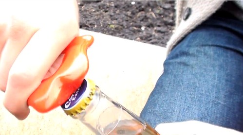
Unfortunately, it did rain during our shoot in town. This meant we did not have time to rearrange the location of the filming.
Luckily the rain soon stopped so we were able to continue unabated.
Our narrative remained essentially unchanged. The only thing that differs is the lack of a girlfriend or argument as we instead opted to only utilise the singer for this narrative section.
This was mainly because we felt the inclusion of this narrative thread would feel tired, trite and cliched.
We conformed to genre conventions of indie rock as originally planned. The only thing that might be conceived as uncharacteristic is our ancillary texts as we have used a brighter colour scheme for these products compared to current artists.
When it came to the drama studio, we decided to use the music studio instead. Unfortunately this has bright green walls, so the use of desaturation during the editing process manages to hide this fact as well as stick to genre conventions.
Well, firstly we have used a house for a setting in our music video. Secondly we stuck to our original idea and interpretation of the song which we believe ended up in a successful video.
Our teacher Holly watched our rough-cut and gave us feedback on what we've done so far and what she feels could be added to the video to improve it. One of the first things she picked up on was the good performance of the band members and particularly Michael's role as the lead singer & guitarist.
Holly also said we need to be aware that we'll need to keep up the pace of our cuts and editing, especially our edits on the beat. Because of this advice we were conscious to maintain the same speed of editing.
After other suggestions from Holly we also implemented more cutaways to Michael walking in the streets and the use of split-screen in our video.
After we finished our music video and ancillary products and uploaded them to the blog we received feedback on them from our classmates and peers.
For the ancillary products there were comments that were raised multiple times, either positive or negative.
A positive point that was brought up by all of the groups was the good use of colour and effects in our poster and digipak. The posterization we used on the band members was a popular effect we used so we're pleased with this feedback.
Other positive feedback included that it represented the artist and genre effectively, the information was clearly visible and that the magazine advert and digipak were closely linked and there was an obvious theme.
Unfortunately we also received negative feedback for these ancillary texts. Though thankfully this was minimal, as the only negatives were the lack of "extra" information on the magazine advert and that the back panels of the digipak were too plain.
When it came to the magazine advert we were fine with this negative feedback as we purposefully neglected to include any reviews or quotes about the digipak. We did this to maintain our minimalist theme of our products and we felt that it also fitted with our genre conventions.
With the negative feedback about the digipak, we believe this to be fair, but are also adamant about the reasons we did this. The spaces with only our background pattern are where we're putting the DVD and CD so we decided that we should keep this area clear because it'd be wasted time and effort for something the consumer will not be looking at.
With the feedback on our music video, again it was mostly positive from our classmates. They almost unanimously agreed that our video used a wide variety of shot types, was well edited and fitted with our genre's conventions. The only negatives we received is that they felt we should have included more shots of Michael walking down a certain street because they felt it was effective.
We agree that this was an effective shot but we used it to it's capacity for the video, and because it is a narrative video we can only include it in sequence.
Monday 3 December 2012
Q1-23 Feedback
The poster is really good, the use of colour in the picture is good, it works well with the genre. You can tell that it is part of the band. It has all the information clearly and the text is appropriate for the genre.
The ancillary product again is really good, the images match together well, they look really professional, the colours are the same as the magazine advert. You can get all the information from the back. However I think that the 2 plain squares are a bit lazy and could have something on them, but apart from that its really good.
The ancillary product again is really good, the images match together well, they look really professional, the colours are the same as the magazine advert. You can get all the information from the back. However I think that the 2 plain squares are a bit lazy and could have something on them, but apart from that its really good.
Q1-24 Feedback
Positive Feedback (Digi-Pak):
- Use of space was done really well - simple but effective
- Looks really well thought out and organised
- The colours compliment each other - subtle but effective
- The techniques used in photoshop look professional and well exhibited
- The images demonstrate the genre and the conventions of the group
- We like how the font is highlighted - it makes it look edgy and professional compared with real digipaks
Negative Feedback (Digi-Pak):
- Doesn't really clarify the genre or the artist's star persona
Positive Feedback (Magazine)
- Looks professional, unique
- The colors compliment each other
- Creates and animated effect which works really well
- The positioning of the writing looks really effective, like it stands out yet the type of font makes it looks really simple
- The star persona is clearly identified
- How they've used photoshop, in such a creative way with the block of colors across his face
Negative Feedback (Magazine)
- At first glance wouldn't be sure of the genre of music, looks electronic, punk etc.
Q1-19 Feedback
Digipak - the digipak shows good examples of editing and use of technologies such as photoshop. The layout reminds us of the band The Gorillaz. The plain white background has a good effect because it draws attention to the pictures of the artist. the back of the digipak has an effective way of writing what the digipak includes, however it could be improved by including a picture behind where the discs will go instead of it being completely white.
Magazine Advert - the magazine advert is well linked to the digipak, but without being repetitive. It is eye catching but lacks information, things such as ratings and quote would improve it.
Magazine Advert - the magazine advert is well linked to the digipak, but without being repetitive. It is eye catching but lacks information, things such as ratings and quote would improve it.
Sunday 2 December 2012
Evaluation Tasks
Task One
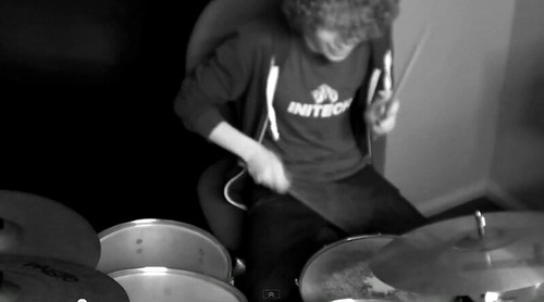
This clip here (0:32) shows one of the multiple shots we did of the band performing the song. Focusing on one band member at a time allows us to show off their individual skill, which is a genre convention for indie rock music videos. Because of this we have included a lot of these shots in our music video, either of the bassist plucking the strings, the drummer hitting his symbols or of the singer strumming the guitar. To keep in time with the song and to make sure the video is engaging these shots are kept short, at most only lasting a couple of seconds before we switch to a new shot.
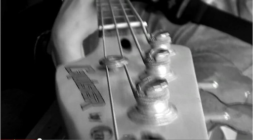
Here (0:34) we see an unusual shot type we experimented with in our music video of the camera moving down the bassists guitar neck. We used this because during our research and planning stage we found that a large number of indie rock music videos use a wide array of shot types including more experimental, unconventional shots such as this. This shot was easy to accomplish and it fulfilled our need of interesting shots that stick with the convention of this genre.
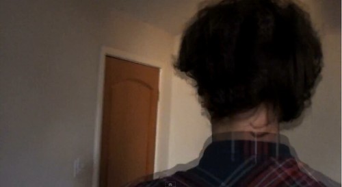
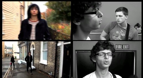
In our video we used tracking shots in both the narrative and the performance sequences. The screen shot here (1:00) is during a narrative sequence. Here we tracked the singer leaving his house, but we also edited the shot to create an interesting image. Again this type of editing is used frequently in the indie rock genre as it creates a "quirky" off-kilter vibe for the music video.
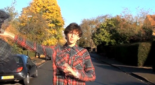
At this part of the music video (1:34) we have used a tracking shot as the singer makes his way towards the centre of town and to his friends. We wanted to keep this interesting and off-kilter we decided to use an action in this shot to help with that. Here we see the singer throw away both his coat and his shirt only to have his coat inexplicably thrown back to him. We used this because we noticed that there was a continuity error we had missed while filming as we filmed on separate days, the singer was wearing a different top. I then came up with the idea of using this type of shot/action to create an interesting part of the video, fix the continuity error and stick with genre conventions.
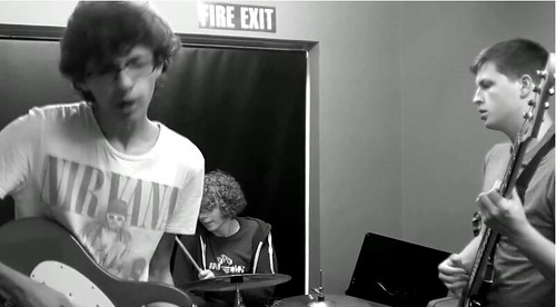
This screen shot (1:52) shows a major genre convention we have stuck to. This is a performance sequence with the bad as a whole. This was featured in just about every single indie rock music video we researched so we obviously took cue and followed suit. This shot shows the band as a whole, playing the song to give the audience an idea of how the band act together, and what they might be like live. Unfortunately because of a lack of space, equipment and band members, we were only able to use 3 people in the band. While there are various 3-piece indie bands, e.g. The Subways, unfortunately we can quite clearly hear instruments that are not being played on screen.
This split-screen (2:38) was used under the suggestion of our teacher Holly. The split-screen effect is used in certain indie rock videos and multiple other music videos from a wide range of genres. We kept ours relatively short compared to some videos that use this effect, but because of the movement used and our inclusion of other important genre conventions it is still effective at attracting audience attention.
At this section of our music video (3:02) we seen our singer finally reach his destination and meet up with his friends. We shot this at a sunny time and location because we wanted the lighting to reflect the mood of the singer as well as reflecting the mood of the lyrics. This is another genre convention we have used, narrative that reflects the lyrical content, to create a better music video than if we had ignored it.
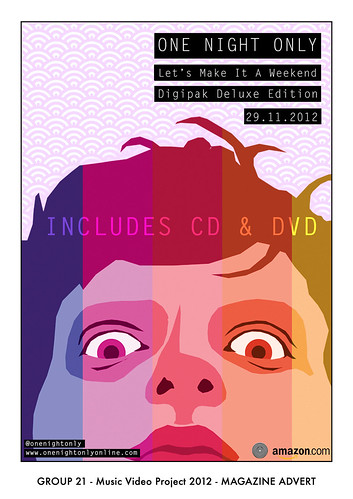
Here is our finished magazine poster. As you can see with have kept this style minimalist featuring only a face for the poster. This is a genre convention as most of the posters and magazine adverts we saw for indie rock groups kept the designs minimal and a large amount used a head or a face, usually with some form of "twist". An example we looked at while still in the research and planning stage for our ancillary products was this Kings of Leon poster. Here you can see that it has used a collage effect to create an overall head from composites of the band members. However they use a very muted colour pallet whereas we decided to go against convention and keep ours brighter and more colourful. We decided to do this because we felt it better reflected the band we had chosen, whom mainly compose songs about and aimed at late teens, as well as being able to attract other audiences better.
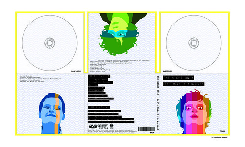
Here is our final digipak design. We created an obvious link between our two ancillary products, the posterised faces and the background patter. This again was a genre convention as most examples we researched had some form of obvious link between the two, whether it be the cover or a general theme. We have again kept this light, using a pale blue for our background and having the band members in shades of bright colours. The only dark parts of this are the black backgrounds against the white text. We have used this because it creates a feeling similar to that of old Polaroid photographs.
Task Two
Task 3
Task 4
Oh Yeah
by: BeachesAndShores
Task Two
Task 3
Task 4
Oh Yeah
by: BeachesAndShores
Saturday 1 December 2012
Subscribe to:
Posts (Atom)