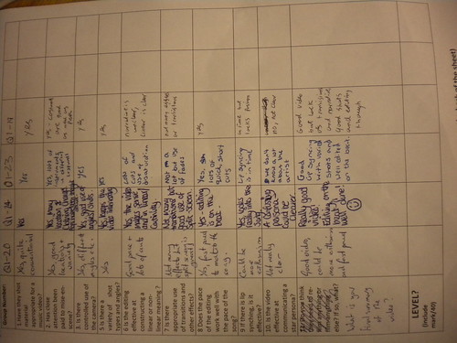
Goodwins Points Analysis
1. Genre Characteristics
For our music video we have conformed to genre characteristics, so we make use of performance sequences to show the band's talent. To be able to perform the performance sequences I brought in my bass and guitar. We also managed to acquire the use of a bass and a performance area for the filming. Having this performance area and the props needed for filming allowed us plenty of opportunities to shoot performance sequences for the video.We also made use of a narrative for our music video, showing our lead singer leaving his house to meet with some friends. The way we use this is by cutting from the performance sequences to the narrative sequences intermittently so we don't bore the audience and can progress the music video.
By doing this we have hopefully managed to create a music video fitting with the indie rock genre.
2. Visuals/Lyrics
We don't make much use of matching the visuals to the lyrics besides lip syncing. The only other time we have matched the visuals to the lyrics would be when the singer is leaving his house, the lyrics
"You wanted me to stay at home
But I didn't want too"
Here we have a sped up tracking shot of the singer leaving his house.
3. Visuals/Music
We have matched the visuals to the music in our video so far, as we have edited on the beat throughout the video. We did this as we believe this makes it much easier for the audience to watch as it makes the video flow. It also helps the video much more professional as the editing comes across as seamless.
4. Need To Sell Artist
We have made the singer the focus of our music video, in both the performance and the narrative sequences.
For the performance sequences we have also included shots of the drummer and bassist but because we wanted to include lip syncing and to follow genre conventions the singer is the prominent focus. In the narrative sections we have also made the singer the focus, as we again wanted to sell the artist as this is what a record company would want as this promotes the band's image.
5. Intertextuality
We haven't included much intertextuality because we didn't see how to this would really be relevant to our music video. The only piece of intertextuality we have included so far is the singer's Nirvana t-shirt in the performance sequences and we included this because we felt it would show the bands influences.
6. Voyeurism
We have used voyeurism in our music video as the audience sees the artist at home, what his lifestyle may be like and by showing the small amount of the house they can see what his home life is like. Later in the music video they will also see what his social life is like and where they socialise.
Micro Elements Analysis
1. Editing
So far we have used a couple of editing techniques to improve the image our music video. We have used a desaturation filter over the performance parts of the video as this helps hide where we filmed this sequence as originally this was a green room for our Sixth Form's media department and so it had bright green walls. Editing on the beat is another technique, which makes the video easier to follow for the audience and look more professional. We also made use of a fade at the start of the video to smoothly start the video instead of a sudden start. Speeding up clips is another way we edited our video. When the artist is leaving his home, and we have a tracking shot, we sped up the clip 500% because the song speeds up slightly here and this matches the tempo and beat of the music.
2. Cinematography
We used many different shot types throughout the video to make it interesting as repeated use of the same type of shot would make the video look unprofessional and difficult to watch for the audience. We have used the normal close up and mid shots which just add a variation of distance between the camera and the object (artist normally), we have also made use of tracking shots of the singer in the video, as the camera movement helps the flow of the video. Using over the shoulder shots is another shot we used, most prominently seen when the singer is leaving his house, which we also combine with a tracking shot. We have used high angle shots for the performance sequences of the band members and also of the singer when he is laying on his sofa. Extreme close ups on the instruments to see the band members playing them and in the start of the music video where we see an amp being turned on and the bass being tuned. A low angle shots have also been used, with the singer in the performance sequence and also in the narrative sequences too. We have also use a dutch angle shot briefly in the performance sequence where the camera tracks down the neck of the bass.
3. Sound
The main sound in the video is the track playing, however we have also at the beginning of the video left in the diagetic sound. This diagetic sound is of the drummer warming up, as we can hear him gently hitting his drums and of the amp being turned on.
Once the lead has been plugged into the amp the non-diagetic sound of the music starts.
4. Mise-En-Scene
For mise-en-scene, we were very careful about what we used and what was filmed. For the costumes we were very conscious of continuity of the video, so we made sure that different costumes were worn for the performance and the narrative sequences. Also because we filmed the performance on two separate days we made sure that the same costumes were worn. We only used natural lighting in our video, as when we began filming we realised that the natural light was fine for shooting as everything was clearly illuminated. The props we used were, alcohol in sequences not yet included in the rough cut, which was to show his casual lifestyle and socialising with his friends and the instruments used when performing.So far we have used three main locations, the singers house, the performance space and finally the village the singer is walking through. Later more locations will be added, such as the centre of Cambridge and Christ Pieces where he will be meeting his friends. Make-up and hair were ignored as we have an all male indie band so the band members needed to come across as aloof and carefree and having a pruned look would ruin that image.
Improvements
1. Experiment with some other filters, to help create a distinct look, mainly in the narrative sequences.
2. Use more cuts, the beat of the song is fairly quick we need to decide whether we want to cut on the bigger beats or onto the quicker, small beats of the song as this will decide how many cuts we will use in our music video.
3. Include more intertextuality, as we only have once piece of intertextuality and including it would be something that would make the video appear better as it would show knowledge of other media or other artists work.
4. Use of a lager performance space, as the space we used was quite small and so fitting the entire band and instruments in left it rather cramped. It also left very little room for camera movement and different shots as the space was so limited.
5. We could include more people in the music video, as we have a small 3 piece band at the moment and the singer only meets two friends later in the video. Including more people would make the singer look much more popular and give the social aspect of the video a bit more significance.
Additional Time Usage
If we were to use an additional nights of filming time, it would used to shoot more narrative scenes. This would be so we could include more shot types and camera movement and we need to refilm certain shots as we can see equipment in some shots making the video look unprofessional and sloppy.
Also, as the weather was a dull and drizzly day, we would be able to get a more light hearted feel for the video as the sun would impact significantly on the overall feeling of these scenes.


 Another example is the internet. Websites such as YouTube is a great way to exhibit your video to the world, as YouTube allows anything and everything, varying from different styles and genre, to commercial and non-commercial music videos. YouTube works well as you can upload the video yourself, notify your fans through Twitter and Facebook, and you would eventually get views. Alternatively, fans can subscribe to your YouTube channel and keep up to date with your uploads. Therefore, websites like YouTube would be able to exhibit our video as you do not need to be mainstream and popular in order to exhibit your video. All you need to do is upload it yourself.


