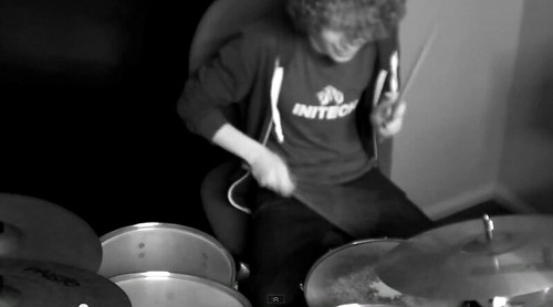
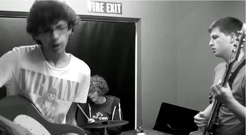
This clip here (0:32) shows one of the multiple shots we did of the band performing the song. Focusing on one band member at a time allows us to show off their individual skill, which is a genre convention for indie rock music videos. Because of this we have included a lot of these shots in our music video, either of the bassist plucking the strings, the drummer hitting his symbols or of the singer strumming the guitar. To keep in time with the song and to make sure the video is engaging these shots are kept short, at most only lasting a couple of seconds before we switch to a new shot.
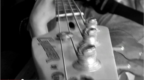
Here (0:34) we see an unusual shot type we experimented with in our music video of the camera moving down the bassists guitar neck. We used this because during our research and planning stage we found that a large number of indie rock music videos use a wide array of shot types including more experimental, unconventional shots such as this. This shot was easy to accomplish and it fulfilled our need of interesting shots that stick with the convention of this genre.
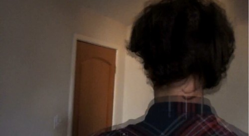
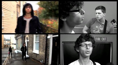
In our video we used tracking shots in both the narrative and the performance sequences. The screen shot here (1:00) is during a narrative sequence. Here we tracked the singer leaving his house, but we also edited the shot to create an interesting image. Again this type of editing is used frequently in the indie rock genre as it creates a "quirky" off-kilter vibe for the music video.
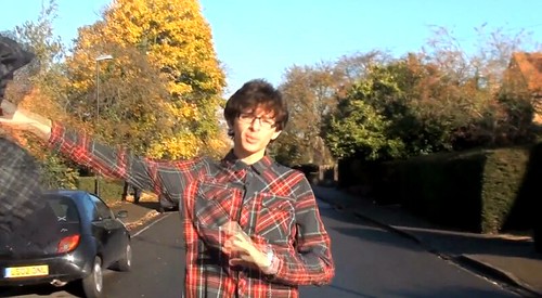
At this part of the music video (1:34) we have used a tracking shot as the singer makes his way towards the centre of town and to his friends. We wanted to keep this interesting and off-kilter we decided to use an action in this shot to help with that. Here we see the singer throw away both his coat and his shirt only to have his coat inexplicably thrown back to him. We used this because we noticed that there was a continuity error we had missed while filming as we filmed on separate days, the singer was wearing a different top. I then came up with the idea of using this type of shot/action to create an interesting part of the video, fix the continuity error and stick with genre conventions.
This screen shot (1:52) shows a major genre convention we have stuck to. This is a performance sequence with the bad as a whole. This was featured in just about every single indie rock music video we researched so we obviously took cue and followed suit. This shot shows the band as a whole, playing the song to give the audience an idea of how the band act together, and what they might be like live. Unfortunately because of a lack of space, equipment and band members, we were only able to use 3 people in the band. While there are various 3-piece indie bands, e.g. The Subways, unfortunately we can quite clearly hear instruments that are not being played on screen.
This split-screen (2:38) was used under the suggestion of our teacher Holly. The split-screen effect is used in certain indie rock videos and multiple other music videos from a wide range of genres. We kept ours relatively short compared to some videos that use this effect, but because of the movement used and our inclusion of other important genre conventions it is still effective at attracting audience attention.
At this section of our music video (3:02) we seen our singer finally reach his destination and meet up with his friends. We shot this at a sunny time and location because we wanted the lighting to reflect the mood of the singer as well as reflecting the mood of the lyrics. This is another genre convention we have used, narrative that reflects the lyrical content, to create a better music video than if we had ignored it.
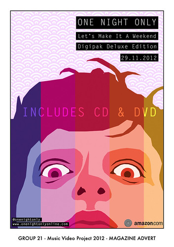
Here is our finished magazine poster. As you can see with have kept this style minimalist featuring only a face for the poster. This is a genre convention as most of the posters and magazine adverts we saw for indie rock groups kept the designs minimal and a large amount used a head or a face, usually with some form of "twist". An example we looked at while still in the research and planning stage for our ancillary products was this Kings of Leon poster. Here you can see that it has used a collage effect to create an overall head from composites of the band members. However they use a very muted colour pallet whereas we decided to go against convention and keep ours brighter and more colourful. We decided to do this because we felt it better reflected the band we had chosen, whom mainly compose songs about and aimed at late teens, as well as being able to attract other audiences better.
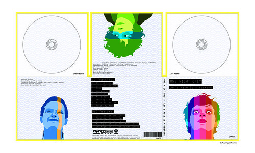
Here is our final digipak design. We created an obvious link between our two ancillary products, the posterised faces and the background patter. This again was a genre convention as most examples we researched had some form of obvious link between the two, whether it be the cover or a general theme. We have again kept this light, using a pale blue for our background and having the band members in shades of bright colours. The only dark parts of this are the black backgrounds against the white text. We have used this because it creates a feeling similar to that of old Polaroid photographs.
No comments:
Post a Comment