Media Project
by: Stormatree
Task 3
Thursday, 13 December 2012

Wednesday, 12 December 2012
Wednesday, 5 December 2012
Evaluation Task 3 Planning/Script
- Whole music video
- Ancillary tasks downloaded onto a phone
- Talk about pitch feedback
- Talk about rough-cut feedback from Holly
- Feedback on final video from classmates
- Record on Wednesday
Unfortunately, it did rain during our shoot in town. This meant we did not have time to rearrange the location of the filming.
Luckily the rain soon stopped so we were able to continue unabated.
Our narrative remained essentially unchanged. The only thing that differs is the lack of a girlfriend or argument as we instead opted to only utilise the singer for this narrative section.
This was mainly because we felt the inclusion of this narrative thread would feel tired, trite and cliched.
We conformed to genre conventions of indie rock as originally planned. The only thing that might be conceived as uncharacteristic is our ancillary texts as we have used a brighter colour scheme for these products compared to current artists.
When it came to the drama studio, we decided to use the music studio instead. Unfortunately this has bright green walls, so the use of desaturation during the editing process manages to hide this fact as well as stick to genre conventions.
Well, firstly we have used a house for a setting in our music video. Secondly we stuck to our original idea and interpretation of the song which we believe ended up in a successful video.
Our teacher Holly watched our rough-cut and gave us feedback on what we've done so far and what she feels could be added to the video to improve it. One of the first things she picked up on was the good performance of the band members and particularly Michael's role as the lead singer & guitarist.
Holly also said we need to be aware that we'll need to keep up the pace of our cuts and editing, especially our edits on the beat. Because of this advice we were conscious to maintain the same speed of editing.
After other suggestions from Holly we also implemented more cutaways to Michael walking in the streets and the use of split-screen in our video.
After we finished our music video and ancillary products and uploaded them to the blog we received feedback on them from our classmates and peers.
For the ancillary products there were comments that were raised multiple times, either positive or negative.
A positive point that was brought up by all of the groups was the good use of colour and effects in our poster and digipak. The posterization we used on the band members was a popular effect we used so we're pleased with this feedback.
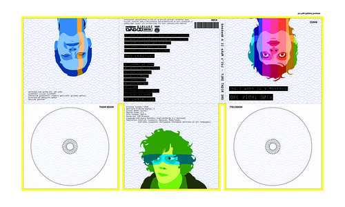
Other positive feedback included that it represented the artist and genre effectively, the information was clearly visible and that the magazine advert and digipak were closely linked and there was an obvious theme.
Unfortunately we also received negative feedback for these ancillary texts. Though thankfully this was minimal, as the only negatives were the lack of "extra" information on the magazine advert and that the back panels of the digipak were too plain.
When it came to the magazine advert we were fine with this negative feedback as we purposefully neglected to include any reviews or quotes about the digipak. We did this to maintain our minimalist theme of our products and we felt that it also fitted with our genre conventions.
With the negative feedback about the digipak, we believe this to be fair, but are also adamant about the reasons we did this. The spaces with only our background pattern are where we're putting the DVD and CD so we decided that we should keep this area clear because it'd be wasted time and effort for something the consumer will not be looking at.
With the feedback on our music video, again it was mostly positive from our classmates. They almost unanimously agreed that our video used a wide variety of shot types, was well edited and fitted with our genre's conventions. The only negatives we received is that they felt we should have included more shots of Michael walking down a certain street because they felt it was effective.
We agree that this was an effective shot but we used it to it's capacity for the video, and because it is a narrative video we can only include it in sequence.
Monday, 3 December 2012
Q1-23 Feedback
The poster is really good, the use of colour in the picture is good, it works well with the genre. You can tell that it is part of the band. It has all the information clearly and the text is appropriate for the genre.
The ancillary product again is really good, the images match together well, they look really professional, the colours are the same as the magazine advert. You can get all the information from the back. However I think that the 2 plain squares are a bit lazy and could have something on them, but apart from that its really good.
The ancillary product again is really good, the images match together well, they look really professional, the colours are the same as the magazine advert. You can get all the information from the back. However I think that the 2 plain squares are a bit lazy and could have something on them, but apart from that its really good.
Q1-24 Feedback
Positive Feedback (Digi-Pak):
- Use of space was done really well - simple but effective
- Looks really well thought out and organised
- The colours compliment each other - subtle but effective
- The techniques used in photoshop look professional and well exhibited
- The images demonstrate the genre and the conventions of the group
- We like how the font is highlighted - it makes it look edgy and professional compared with real digipaks
Negative Feedback (Digi-Pak):
- Doesn't really clarify the genre or the artist's star persona
Positive Feedback (Magazine)
- Looks professional, unique
- The colors compliment each other
- Creates and animated effect which works really well
- The positioning of the writing looks really effective, like it stands out yet the type of font makes it looks really simple
- The star persona is clearly identified
- How they've used photoshop, in such a creative way with the block of colors across his face
Negative Feedback (Magazine)
- At first glance wouldn't be sure of the genre of music, looks electronic, punk etc.
Q1-19 Feedback
Digipak - the digipak shows good examples of editing and use of technologies such as photoshop. The layout reminds us of the band The Gorillaz. The plain white background has a good effect because it draws attention to the pictures of the artist. the back of the digipak has an effective way of writing what the digipak includes, however it could be improved by including a picture behind where the discs will go instead of it being completely white.
Magazine Advert - the magazine advert is well linked to the digipak, but without being repetitive. It is eye catching but lacks information, things such as ratings and quote would improve it.
Magazine Advert - the magazine advert is well linked to the digipak, but without being repetitive. It is eye catching but lacks information, things such as ratings and quote would improve it.
Sunday, 2 December 2012
Evaluation Tasks
Task One
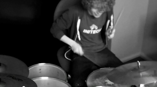
This clip here (0:32) shows one of the multiple shots we did of the band performing the song. Focusing on one band member at a time allows us to show off their individual skill, which is a genre convention for indie rock music videos. Because of this we have included a lot of these shots in our music video, either of the bassist plucking the strings, the drummer hitting his symbols or of the singer strumming the guitar. To keep in time with the song and to make sure the video is engaging these shots are kept short, at most only lasting a couple of seconds before we switch to a new shot.
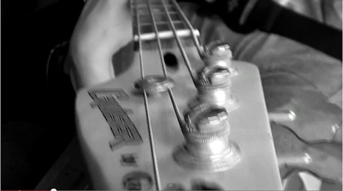
Here (0:34) we see an unusual shot type we experimented with in our music video of the camera moving down the bassists guitar neck. We used this because during our research and planning stage we found that a large number of indie rock music videos use a wide array of shot types including more experimental, unconventional shots such as this. This shot was easy to accomplish and it fulfilled our need of interesting shots that stick with the convention of this genre.
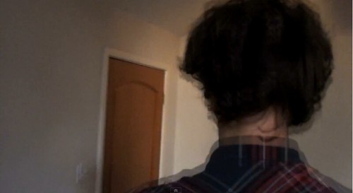
In our video we used tracking shots in both the narrative and the performance sequences. The screen shot here (1:00) is during a narrative sequence. Here we tracked the singer leaving his house, but we also edited the shot to create an interesting image. Again this type of editing is used frequently in the indie rock genre as it creates a "quirky" off-kilter vibe for the music video.
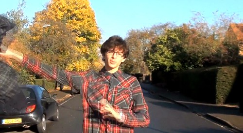
At this part of the music video (1:34) we have used a tracking shot as the singer makes his way towards the centre of town and to his friends. We wanted to keep this interesting and off-kilter we decided to use an action in this shot to help with that. Here we see the singer throw away both his coat and his shirt only to have his coat inexplicably thrown back to him. We used this because we noticed that there was a continuity error we had missed while filming as we filmed on separate days, the singer was wearing a different top. I then came up with the idea of using this type of shot/action to create an interesting part of the video, fix the continuity error and stick with genre conventions.
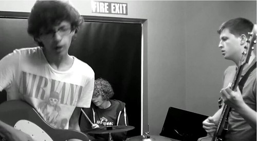
This screen shot (1:52) shows a major genre convention we have stuck to. This is a performance sequence with the bad as a whole. This was featured in just about every single indie rock music video we researched so we obviously took cue and followed suit. This shot shows the band as a whole, playing the song to give the audience an idea of how the band act together, and what they might be like live. Unfortunately because of a lack of space, equipment and band members, we were only able to use 3 people in the band. While there are various 3-piece indie bands, e.g. The Subways, unfortunately we can quite clearly hear instruments that are not being played on screen.
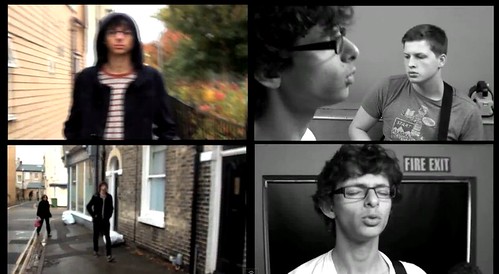
This split-screen (2:38) was used under the suggestion of our teacher Holly. The split-screen effect is used in certain indie rock videos and multiple other music videos from a wide range of genres. We kept ours relatively short compared to some videos that use this effect, but because of the movement used and our inclusion of other important genre conventions it is still effective at attracting audience attention.
At this section of our music video (3:02) we seen our singer finally reach his destination and meet up with his friends. We shot this at a sunny time and location because we wanted the lighting to reflect the mood of the singer as well as reflecting the mood of the lyrics. This is another genre convention we have used, narrative that reflects the lyrical content, to create a better music video than if we had ignored it.
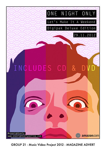
Here is our finished magazine poster. As you can see with have kept this style minimalist featuring only a face for the poster. This is a genre convention as most of the posters and magazine adverts we saw for indie rock groups kept the designs minimal and a large amount used a head or a face, usually with some form of "twist". An example we looked at while still in the research and planning stage for our ancillary products was this Kings of Leon poster. Here you can see that it has used a collage effect to create an overall head from composites of the band members. However they use a very muted colour pallet whereas we decided to go against convention and keep ours brighter and more colourful. We decided to do this because we felt it better reflected the band we had chosen, whom mainly compose songs about and aimed at late teens, as well as being able to attract other audiences better.
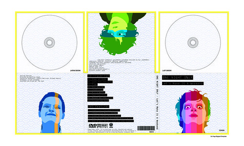
Here is our final digipak design. We created an obvious link between our two ancillary products, the posterised faces and the background patter. This again was a genre convention as most examples we researched had some form of obvious link between the two, whether it be the cover or a general theme. We have again kept this light, using a pale blue for our background and having the band members in shades of bright colours. The only dark parts of this are the black backgrounds against the white text. We have used this because it creates a feeling similar to that of old Polaroid photographs.
Task Two
Task 3
Task 4
Oh Yeah
by: BeachesAndShores
Task Two
Task 3
Task 4
Oh Yeah
by: BeachesAndShores
Saturday, 1 December 2012
Thursday, 29 November 2012
Final Ancillary Texts
Monday, 26 November 2012
Final Music Video Feedback
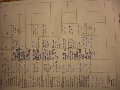
We received feedback for our final music video from all the groups in our class. When all feedback was reviewed, we spotted a number of things:
- The music video definitely has appropriate content
- Mise-en-scene has been payed close attention, as there were use of costumes and different lighting techniques
- There was controlled use of the camera
- A lot of different camera angles were used
- The editing was effective of creating a linear meaning
- There were a few effects and transitions included in the video
- The editing worked perfectly with the pace of the song
- Lip syncing was effective
- Apparently the star persona is not clear
- Overall, the music video was well executed
Taking this feedback into account, we believe the music video we creating is outstanding. One thing we should improve on in the future is making the star persona more clear to the audience.
Monday, 19 November 2012
Thursday, 8 November 2012
Digipak Ideas
After experimenting with using posterization in photoshop, we have agreed that this can create an interesting and effective cover.
We have discussed using all 3 members of the band on different sides of the Digipak, with Michael, the lead singer in our video, being on the cover.
Using this we can create a continuous feel for the digipak. Saying this though, we do feel that while minimalism is a genre convention of indie rock album covers, using just posterized faces like in our previous post may be too simplistic/minimal.
To combat this we are thinking of inserting a continuous pattern into the back ground. An example of this would be from the band Kid, You'll Move Mountains, who in both their advert for their album "Loomings" use an interesting pattern.
Here, in the advert for the album, it is used to create a wave like effect, which we like. We are thinking about using this kind of pattern, or one very similar, to give a more interesting and diverse look to our cover while maintaining an indie rock and minimalistic feel.

In the album cover, the same pattern is used to a different effect, rather than creating a wave-like effect, it acts more as a background pattern to break the monotony of the image.

Digipak Test Posterizing
Here we have an image we posterized manually of popular musician Neil Fallon of Clutch.
We have done this so we can assess the effectiveness of using posterized images for our digipak and/or magazine advert.
Here is the original picture for reference:


We have done this so we can assess the effectiveness of using posterized images for our digipak and/or magazine advert.
Here is the original picture for reference:
And this is the version we posterized, and we believe that this technique can be used effectively for our Digipak if done well:
Tuesday, 6 November 2012
Elliott Slingsby: Task 5
Task 5:
Below you can see the two videos I reference later on.
Here It Goes Again:
This Too Shall Pass (Rube Goldberg Version):
How would you describe their star persona?
OK Go's star persona is very quirky and unique compared to other artists, because even though they produce serious songs, their videos are far from it, and are usually hard and laborious to actually produce.
What use of Goodwin's theory is made in their videos?
OK Go seem to take a very different approach on Goodwin's theories, because very few of them are implemented often. For example, the most obvious one is the relationship between visuals and lyrics, because literally in every video they've produced, the relationship is non existent.
When it comes to the relationship between the visuals and the music itself, OK Go take a very unconventional approach to it. This is evident in the video "This Too Shall Pass (Rube Goldberg Version)", because instead of doing the convention editing on the beat to link the visuals and music, they link actions to the music, even to the point where the rube goldberg mechanism itself plays a small section of the song using forks and wine glasses.
In "Here It Goes Again", you can also see that they link actions to the music, but in this case the actions are dance moves intricately timed on running machines.
How would you describe their target audience?
OK Go's videos are very much targeted towards the internet community, mainly the YouTube community.
How are they attempting to appeal to art alternative audience?
OK Go reach their audience very successfully by making their videos very unique and interesting, as an attempt to make them go viral, and with the video count of up to 15 Million on some of their videos, is obviously very effective.
How would you describe the target audience for your music video?
The target audience for our music video is very similar to OK Go's, because the genre of One Night Only is also indie alt rock.
How are you attempting to target that audience?
Unlike OK Go, we can't produce a very intricate video because we lack time, and the funding. So instead we decided to appeal by making a video that related to the average listener, by having the artist leave the house to have fun in town with friends.
Elliott Slingsby: Task 4
Task 4:
For this task, I chose the YouTube channel (and sub channels) owned by the company "Vevo", and the television channel "MTV", both of which are specifically targeted to show music, and music related media.


The difference between MTV and Vevo is the fact that MTV's main presence is only on the TV, and Vevo's main presence is on YouTube. MTV has been around for a lot longer than Vevo, which has only become popular in the last 2 years.
I don't think that MTV and Vevo would show our video, but no because it wouldn't fit, but because as an indie alt rock band's perspective, it probably wouldn't be good for the band's star persona seeing as they want to upkeep the indie alt rock image.
Elliott Slingsby: Task 3
Task 3:
One Night Only have two connections to social media sites, one of them on Facebook, which you can see below,


One Night Only have two connections to social media sites, one of them on Facebook, which you can see below,

and the other one on Twitter.

Both of these have a very strong connection to their demographic, because the common demographic to indie rock music have a very big part on social networking sites.
We could use Twitter and Facebook in the same way as One Night Only to increase the consumption of our video, because doing making these reached out to a much larger community online, and because our video will be uploaded to YouTube, it would be able to reach everyone online quick and easily.
Elliott Slingsby: Task 2
Task 2:
We’re going to combine are ancillary text and a our music
video together by having Michael, the main artist in the music video, appear in
both the advert and single cover.
The current plan for our CD cover is to have Michael lying
down in a green field, with the band in the background jumping about and being
silly. The shot will be close up in Michael’s face, and the band in the
background will be slightly blurred to draw more focus to Michael. We feel this
would really suite the genre, because it’s not too serious, and it’s pretty
alternative.
Elliott Slingsby: Task 1
Task 1:
Our current rough cut shows off some of Goodwin’s five
points, below are the five points followed by how they’re portrayed in our
rough cut.
1. Lyrics and Visuals Relationship.
We portray this point by having a narrative to our video. The
narrative at the moment is completely clear because our rough cut is unfinished,
but the intention was to have the main artist follow along with the theme of
the song, which is to go out and waste his time in the sunshine. Which you can
see in our rough cut, when Michael, the main artist, puts on his hoodie and
leaves the house to go outside.
2. Music and Visuals Relationship.
This point was portrayed whenever we cut to the actual
instruments being played every now and then. The band playing are playing the
real band “One Night Only”.
3. Genre Characteristics.
The genre characteristics for alternative indie rock can
normally be put across with quirky editing and not so serious actions. We did
this in our rough cut with the cuts of the main artist on the sofa, and we
intend to add more quirky edits by using split screens.
4. Focus on the Vocalist.
We did this by splitting the video into two parts, the
narrative which features the main artist, and the band playing, which focuses on
the band playing the music itself. By doing this we’ve made it so that the
vocalist is focused upon for at least half the entire video. We also reassure this
point by including a lot of close ups of the vocalist.
5. Intertextuality.
We haven’t included any intertextuality as of yet in our
rough cut.
If we could use another day’s worth of filming, then we’d
use it to film the main artist walking around town again but in better weather.
We’d do this because we currently only have the main artist walking around town
in poor rainy conditions, and it doesn’t really suite the song.
Monday, 5 November 2012
Michael Moursi: Rough Cut Feedback
I have managed to show 3 people my rough cut music video and asked for their views and opinions of the video. I asked them what they liked about the video, and anything we should improve on next time we go and edit. This is what they had to say:
- Person 1: I really liked the beginning of the video. The cuts with the singer on the sofa were brilliant. However, as the video went on, the quality of editing slowly went down. So, improve the later on bits with more cuts.
- Person 2: I can see where you are editing and where you are not! The first part of the video was good. But it got sloppy towards the end. The clips need to be shorter. Also, there needs to be more variety.
- Person 3: It was good you were the singer. You looked really indie and it helped the song well. The only bit I would improve is towards the end. More cutaways would be great.
Subscribe to:
Posts (Atom)